


On Choosing Colour Slowly
There are certain colours we only notice when life begins to soften again.
A pale blue glimpsed in morning light. The warmth of washed stone. The quiet confidence of cream against skin. Sometimes colour arrives before we are ready to name what is changing inside us. It appears quietly, asking very little. Only attention.
Perhaps this is why the colours we are drawn to rarely feel accidental.
Certain seasons call for clarity. Others for depth. And some ask for gentleness.
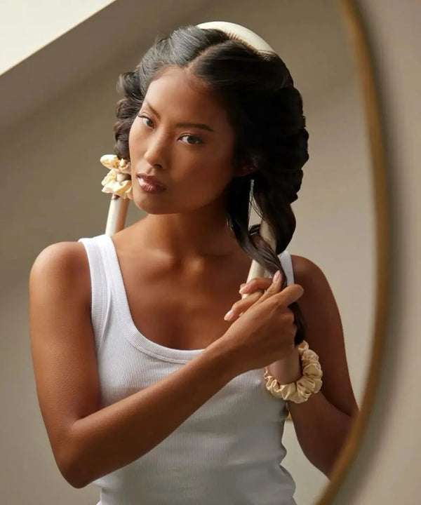
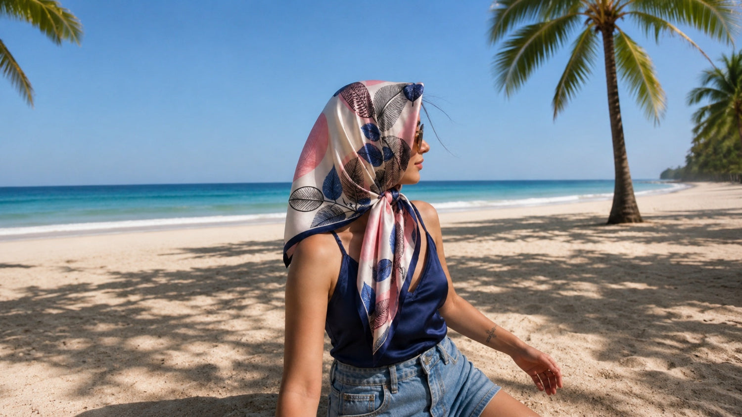
Spring has always felt less like an arrival and more like a return. Not dramatic. Not immediate. Just a gradual reintroduction to lightness. Windows opened again. Linen brought forward. Silk folded back into reach.
Even our eyes seem to slow down.
Choosing Colour Slowly in a Fast-Moving World

In a world that moves quickly between trends, colour can begin to feel strangely disposable. One month everything is muted chocolate. The next, saturated red. Then silver. Then powder pink. We are told what this season means before we have had the chance to feel it ourselves.
But the colours we live with most intimately are rarely chosen in urgency.
They are chosen slowly.
Sometimes over years.
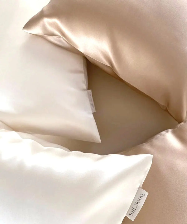
The deep charcoal robe that still feels grounding after countless evenings. The soft ivory pillowcase that changes the atmosphere of a room more than expected. The muted blush scarf reached for instinctively, again and again, without needing to ask why.
Certain colours become companions to a version of ourselves.
Not statements. Signals.
How Silk Transforms the Experience of Colour

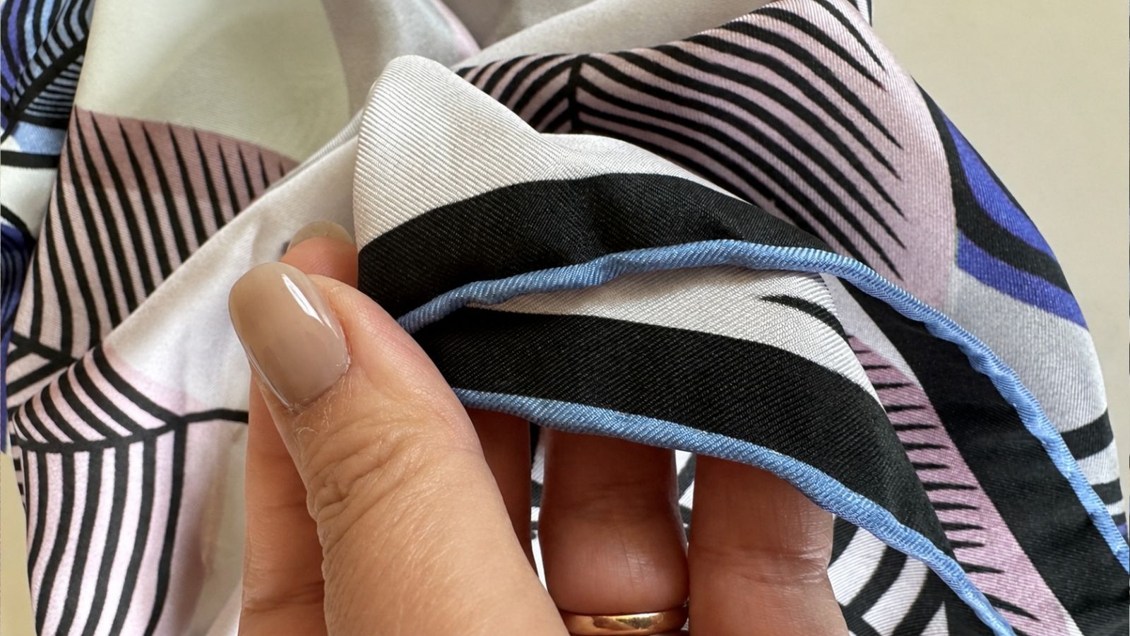
There is something particularly personal about colour when held in silk.
Silk does not absorb colour in the same way as heavier fabrics. It carries it differently. Light moves across the surface instead of stopping at it. Shades appear fluid, almost alive. A muted tone can suddenly feel luminous. A darker shade becomes softer at the edges.
The fabric changes the experience of colour itself.
Perhaps this is part of silk’s enduring appeal across centuries and cultures. Not simply softness, but the way it allows colour to breathe.
The effect is subtle. But subtle things often stay with us longest.
Colour as a Feeling, Not Just a Visual
We tend to think of colour as visual, yet it is deeply emotional. Certain shades calm the nervous system. Others create clarity. Some hold memory. Some create distance. Some feel like expansion.
And often, the colours we choose privately reveal more than the ones we wear publicly.
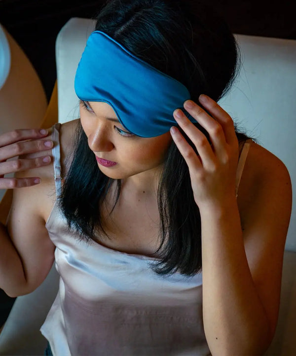
The silk we sleep on.
The scarf folded into a handbag.
The camisole hidden beneath tailoring.
These quieter layers are rarely chosen for performance. They are chosen for feeling.
For atmosphere.
For the way they shape ordinary moments without asking to be noticed.
There is intelligence in that kind of selection.
Not trend awareness, but self-awareness.
Knowing what brings ease.
Knowing what creates softness in a life that can otherwise feel relentlessly sharp.
Spring Silk Collection and the Return to Softness
Perhaps refinement begins there — not in adding more, but in becoming more deliberate about what surrounds us daily.
Including colour.
Especially colour.
This spring, we found ourselves drawn not toward loudness, but toward tones that feel restorative. Powder blue reminiscent of early morning sky. Soft stone shades that quiet a room. Deep earth tones that feel grounding rather than heavy. Colours that do not compete for attention, but gently shape the atmosphere around them.
The kind of colours you continue wanting to live with long after the season changes.
Because the best colours are not always the most dramatic.
Sometimes they are simply the ones that make life feel calmer when you return home to them.
And perhaps that is enough reason to choose them carefully.
Explore the Spring Collection — silk pieces chosen slowly, designed to be lived with.
اترك تعليقًا
تخضع جميع التعليقات للإشراف قبل نشرها.
This site is protected by hCaptcha and the hCaptcha Privacy Policy and Terms of Service apply.